A Transforming Digital Experience
A Scalable & User-Centered Redesign
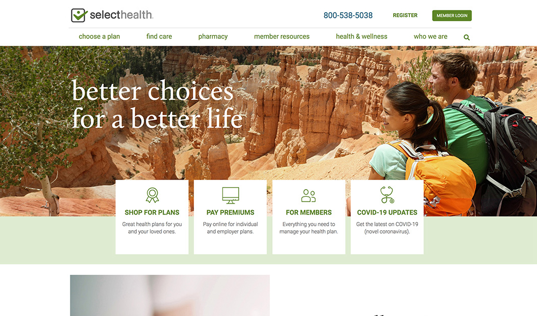
SelectHealth
Project Overview
Company/Client: SelectHealth
Role: Lead UX/UI Designer & Developer
Team: Product Managers, UX Designers, Engineers, Business Stakeholders
Timeline: 12-18 Months
Tools Used: Figma, HTML/SCSS, React, Sirecore
The Challenge
SelectHealth’s digital platform lacked a cohesive user experience, making it difficult for members to find information and manage their healthcare effectively. The previous system had:
- Inconsistent UI patterns, creating usability issues.
- A fragmented content structure, making self-service challenging.
- A slow design-to-dev workflow, delaying feature rollouts.
- An outdated CMS, limiting flexibility for content teams.
The goal was to redesign and rebuild the platform, ensuring a scalable, user-friendly, and efficient experience.
Research & Strategy
Key Research Steps:
- User Behavior Analysis – Identified pain points in navigation and engagement.
- Stakeholder & User Interviews – Gathered insights from members and internal teams.
- Content Management Feasibility Study – Evaluated best practices for structuring content and components.
- Success Metrics Defined – Improve self-service adoption, reduce UI inconsistencies, and enhance content management workflows.
The Solution
Key Enhancements:
- Modular, Reusable Components – Created a design system that reduced UI inconsistencies by 70%.
- Scalable Content Architecture – Structured content for faster updates and localization.
- Personalized User Experience – Leveraged dynamic content and user journeys to tailor member experiences.
- Faster Design-to-Dev Handoff – Improved collaboration, increasing efficiency by 25%.
- Mobile-Optimized Experience – Ensured seamless access across devices.
Implementation & Collaboration
UX/UI Design & Content Strategy
- Built an interactive component library to align UX and development teams.
- Mapped user journeys to a modular content structure, ensuring reusability.
Development & Integration
- Worked closely with developers to implement reusable, content-driven components.
- Integrated React-based UI elements for a flexible and modern frontend experience.
- Optimized performance, ensuring fast page loads and accessibility compliance.
Content Migration & Testing
- Rebuilt content structure, allowing 35% faster content updates.
- A/B tested new UI components to validate effectiveness.
- Conducted extensive QA and user acceptance testing (UAT) before launch.
Results & Impact
Key Outcomes:
- 70% reduction in UI inconsistencies, creating a more polished experience.
- 35% faster design and development cycles, thanks to reusable components.
- 25% increase in design-to-dev handoff efficiency, leading to quicker feature rollouts.
- Improved self-service adoption, with users completing tasks 40% faster.
- Reduced support calls, as members found information more easily.
- Enhanced content flexibility, allowing content teams to update pages without developer support.
Lessons Learned & Next Steps
What Worked:
- Building a modular design system improved both UX consistency and development efficiency.
- Close collaboration between design and engineering teams accelerated development.
Challenges:
Balancing customization with scalability—ensuring components remained flexible.
Next Steps:
- Further refine personalization to deliver tailored member experiences.
- Expand analytics tracking to continuously optimize engagement.